Sunday, 11 November 2012

Progress

Thanks for sticking with me in my quilt making.  I have finished piecing the quilt top and I am now ready to layer it with wadding and backing and start the actual quilting.

Quilt top


Detail
I ended up adding some extra paint to the motifs as I felt the new print block I had made (below) looked a bit too much like a Christmas decoration.  It was a bit laborious but worth it, as the little antler shapes were bugging me.  After all the effort I had put into the design I knew if would really annoy me if I did not tweak them. The difference is slight but is more like my original idea.


I have been exploring the photographs I took at the Luton Hoo walled garden when I had an artist's pass.  The scheme is still going, but I do have a lot of photographs so haven't renewed my subscription. There are a selection on my Flickr site if you're interested. There is so much of interest there and I hope to be able to use the inspiration for some future textile work.

These are studies of old finial posts that had been saved, but what really fascinates me is the fig trees that are trained up against the wall in the old glasshouses.


I've been playing with the levels on some of  pictures.

Winter figs

Spring figs


And just to finish, another page from my sketchbook.

I'm looking forward to a couple of days workshop with Ruth Issett, so I'm not sure I'll get much quilting done!
Hope you have a good week.
Jill

Monday, 5 November 2012

Words fail me...

I'm so upset about the impending doom to our Ash trees that I had to stop myself trying to spot them as I drove across the countryside last week.  Stopping at some traffic lights on a steep hill in town a few years ago was always a moment of pleasure as a mature Ash and a Scots pine met over the road and gave a beautiful patterned silhouette which I have tried to capture from memory.  I always thought I should try to photograph them, but it was a busy junction and before I could get it together they were both felled as part of building work. The two leaf patterns have definite decorative possibilities. I have to turn down the radio and skip past articles in the newspaper if I see the disaster mentioned - ignorance is bliss and I want to be able to enjoy these beautiful graceful trees as long as possible. Don't you just want to weep and tear your hair knowing that there is seemingly nothing to be done to stop them dying? 

Meanwhile the theme for The Sketchbook Challenge this month is the Spice of Life, thinking about what spices your day especially at this time of year.  My thought turned to favourite woollens and so I had a go at sketching the stitches very carefully in pencil adding some Inktense pencil colour to make sense of the rows.


Once sussed, had another go using  pen and lovely spicy colours.


Another thrill this time of year are the berries everywhere - never tire of their vibrant colours.

Meanwhile back in the sewing room...


I have printed all the 'square in a square' blocks and stitched the straight cut blue strippy blocks, adding some prairie points, (all pinned up here on my design 'wall').  Next I am going to have a go at some free cut strips for the top and then add a few printed motifs.  I had to cut a new, smaller block for the printing and the shapes are a little more delineated. I hope they don't appear too Christmassy as that is not the look I'm going for. The brighter orange paper shapes at the top are the original motif.  I could paint over them - cannot decide.  Besides that I am pleased with how much my patchwork resembles my design - I know that was the idea, but I haven't managed to pull it off before!


In between time I have stitched up my bag and lined it - just deciding how to finish it off, whether to add a magnetic clasp which is practical, but a bit clunky, may just make do with a button and a cord. Hopefully tomorrow I'm having some new shelves put up in my sewing room, so I have got to do some clearing out sometime today,
Have a good week
Jill


Wednesday, 31 October 2012

Another month

Another week and another month have blown by and I just have time for a quick post this week...
 October's pages almost complete

Feeling in an illustrative mood  - it will evolve

I've cut all my pieces for the start of my C&G quilt.

Experimenting with the print I will put on the squares - the print blocks are made from foam stuck on mount board.

I added a bit of hand painting to the print - both acrylic paint.


I have quilted this piece ready to be made into a bag. Good practise as I'm very much a novice.  I managed to resolve the problem of skipped stitches in my free motion quilting by changing to a new and thicker needle thanks to this site The Free Motion Quilting Project. Leah Day seems to have covered every aspect of quilting and is a fount of knowledge.  She is obviously a workaholic and produces an unbelievable amount of videos and information.
Off to start stitching those block now.
Keep warm and dry!!
Jill


Monday, 22 October 2012

Still flying

Thanks for all the great comments on my quilt plans, they mean a lot to me.
 I managed to get quite a lot done since my last post.


First I have been practising my free motion embroidery by stitching strips of sari ribbon onto felt, (thanks for the inspiration Gina).


I have also added borders and pinned my patchwork onto wadding and backing ready for quilting- can't decide what pattern to do. But hopefully something will inspire me.


Over the weekend I had a dyeing session and I think I have the blues I want for my C&G quilt.


I have done a couple of pages in my sketchbook on the theme of "Cabinet of Curiosities". Colourful bugs are a favourite of collectors. See 'Sketchbook Challenge'


It's good to do something different.  I do these while (half) watching the TV. 

I  use Koh-i-noor brilliant waterbased dyes - really cheap, and a waterbrush which is brilliant as you don't need a pot of water to paint with - very dodgy in an armchair. You just need a rag or paper towel to wipe the brush on. If you are thinking of buying a waterbrush, don't buy a cheap one without a valve  as the paint back-flows into the reservoir and colours the water - I bought a cheap set of three, and they are useless.


And lastly, we had a magnificent sunset on Saturday. I was busy sewing, but stopped to take these shots through the windows.  Unfortunately this red sky at night was a useless weather forecast as Sunday it did nothing but rain.


Photos straight out of the camera - no enhancing.

Have a good week, whatever you're doing,
Jill


Thursday, 18 October 2012

Buzzing!

I must day I'm buzzing at the moment - not always making a bee-line, but sometimes flying round in circles. However I am making progress. You may feel I'm making a bit of a meal of it, but all this planning is against my spontaneous nature so I have been taking breaks from C&G quilt planning to do other things. 
First over the last few weeks I have been sewing these mini log cabin/courthouse blocks from lots of off-cuts and scraps. The strips are about 2cm wide before sewing.  I have now got enough to sew into a band, and I am intending to make myself a satchel type bag. I am going to add some borders and then quilt it. It is giving me good practice in cutting and stitching, and it is pretty spontaneous so it has been a good break from the formal work. However if I am going to make a bag it will require some planning.


Below is a page for this month's sketchbook challenge "a cabinet of curiosities". As you can see, I could not get away from patchwork and based it on an 'attic windows' pattern, some magazine cut-outs and some drawings fill the spaces.


And here is a frame I've done for my journal.
I've been playing with different colour combos.


Meanwhile back to the quilt planning...
This picture I did in my sketchbook in March has always been talking to me, to I decided on this pattern inspired by my photograph of chimneys agains a blue sky.


Below is my first idea for a quilt.

I made cut outs of all the elements - painted a set and copied more, until I had enough to pin up and play with the composition - actual size. (My design-wall is a strip of sheeting hung over a door.)


It is interesting to see how the flash used in the first photo has altered the colours - the sun came out for the second two arrangements, hence the bright spot at the bottom - lighting was not my priority here. but colours in the last two are truer - the blue is on the turquoise side.
I am favouring the last set-up at the moment.

My next task is to gather together fabrics. I have been to 'Fashion and Fabrics" St Albans' an Aladdin's cave of quilting fabrics and bought a few 30cm lengths and a fat quarter of a selection of oranges and a couple of blues, mixed here with some of my hand-dyed fabrics.  Their blue selection hadn't got what I wanted. Below I have put some lavender blues are on the left, but it is the turquoise/cyan tones I want so I will probably have a dyeing session to give me the more of the blues I want.

Here are a couple of sample squares I made when I started planning, to see if it would work. _ I intend to print the motif into the middle of each square.

Next I shall be experimenting with the right colour for the print - I shall probably use acrylic paint for this. I have also got to think how I will quilt the whole thing - I have got some ideas, but I haven't  fully decided yet.
I'm quite excited by the whole process, but I need to take it step by step - measure at least three times before cutting, and really THINK what I am doing - I am liable to make really glaring mistakes.

Thank you for sticking with me, I value any thoughts, handy tips or ideas you may have, perhaps something I have not thought of. I hope you're having a good week.
Jill


Thursday, 11 October 2012

Aways something new to be learned

I started this blog when I was just finishing two years of studying photography with the Open College of Art - and I was amazed at how much I had to learn - not just about the use of a camera, but also about the qualities of light and colour. How for example - in art we call red a hot colour and blue a cold, but in terms of physics a blue flame or blue light is hotter that red. How to use the white balance to adjust between sunlight - white, and tungsten - yellow and how the the light will vary during the day. I don't use the knowledge consciously, but some of it has rubbed off and made me more aware of these factors when taking photographs.
Colour theory is something I have been aware of, like you, I guess, since school. But when I was heavily into watercolour a good few years ago I read an article by a man called Brian Wilcox called "Blue and Yellow Don't make Green" which actually should be called blue and yellow 'don't necessarily' make green.  I haven't read this, but I have got his book on colour mixing and bought a set of his basic palette of watercolours, with which he reckons you can mix all the colours you need.
He expostulates that a set of red, yellow and blue paints won't do and that you need a warm and cool version of each colour and his set of paints contain the best examples of these - of course all paints are a mix of chemicals and can never be 'pure' like the colours of the spectrum. (By the way since painting these I have learned that it is convention to have yellow at the top)

 
However one colour I did not have or could not mix was a magenta, until I bought a lovely bottle of bright pink magenta acrylic ink. But where did that fit on my spectrum? More later...


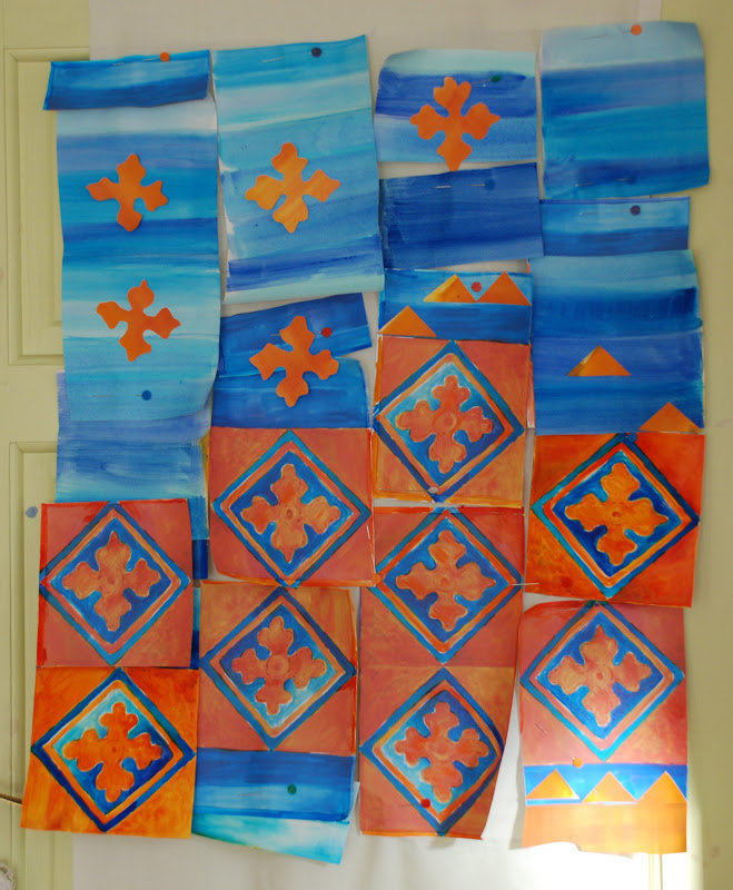
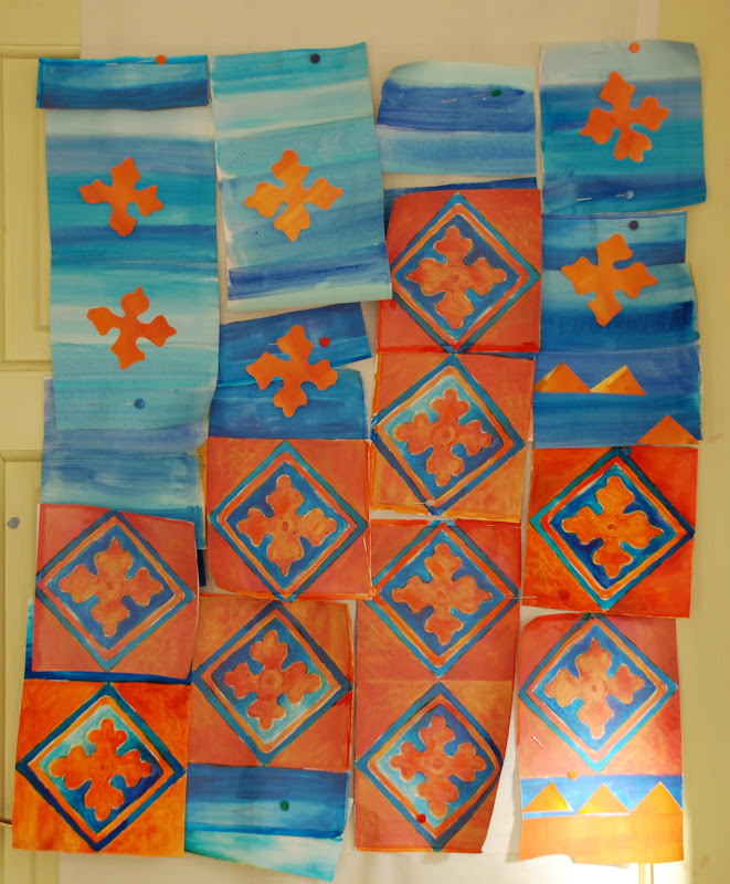
Meanwhile I have been working on my City and Guilds course, putting together ideas for actually making a quilt.


One of my tasks is to look at a contemporary practitioner and think about what makes her work attractive to me.  I chose Alicia Merret whose work I read about in Quilting Art magazine and then I saw her work at FOQ. What attracted me to was her use of colour (as well as her free-form cutting) and further reading revealed that she had studied the work of Josef Albers (1888-1976) and Johannes Itten  (1888- 1967) who had  both written ground breaking works on colour theory.
Alicia talks about 'simultaneous contrast" these are the complementaries that seem to vibrate.


To create these complementaries it is necessary to change the traditional colour wheel and add magenta and cyan.  It is impossible to mix a proper magenta and a cyan is pretty tricky too. So where is magenta on the spectrum?  Well if we bend the spectrum into a circle - like we do with a colour wheel it sort of fits where the ends meet - indigo meets red, but we know these don't mix to make magenta.

Are you still with me? You are doing better than me, I can only just get my head round all of this, but if you are interested the short slide show called Everything You Know About Colour is Wrong on this page has an explanation. Pointless for me to try.
Of course paint, ink and dye act very differently to the pure colours on our computer screens, but many artists develop an intuitive feel when working with colour. Back to Alicia Merret's quilts it is easy to see how her knowledge has fine tuned her instinctive selection of fabrics.

I'm not sure how all of this is going to effect my quilt design, but is is fascinating to me and will help inform me as to why my instincts tell me something is right or wrong.  I am also beginning to realise how small adjustments in colour can make a huge difference and why when I put some colours together, they are just not doing what I want them to do.


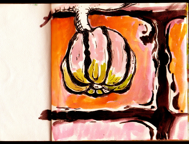
Playing with complementaries 
 I thought this gerbera was more orange until I put it on this blue

The closest to magenta in the garden

I have ordered a copy of Josef Albers' "Interaction of Colour" which is still in print, but the Johhannes Itten's books are a little out of my price range - many copies in the hundreds of pounds, although there are second hand copies available from the USA.
Now I need to get back to some practical activities.
Thanks for sticking with me.
Jill